
Memorisely Bootcamp 058
Product Design
Continuous Learning
DEV-READY SOON
I didn't do this bootcamp because I had to. I did it because I wanted to stay sharp, stay current, and prove something to myself. Memorisely's Design System Bootcamp was one of the most rigorous design exercises I've put myself through, and I came out of it with a full redesign, a living design system, and a working prototype. The subject? Craigslist. One of the most-used and least-loved interfaces on the internet. The brief was simple: fix it.
Memorisely Bootcamp 058
Product Design
Continuous Learning
DEV-READY SOON
I didn't do this bootcamp because I had to. I did it because I wanted to stay sharp, stay current, and prove something to myself. Memorisely's Design System Bootcamp was one of the most rigorous design exercises I've put myself through, and I came out of it with a full redesign, a living design system, and a working prototype.
058
Bootcamp cohort
Working
Design system built
Figma
Primary tool
2024
Year
058
Bootcamp cohort
Working
Design system built
Figma
Primary tool
2024
Year
058
Bootcamp cohort
Working
Design system built
Figma
Primary tool
2024
Year
CHALLENGE
Why Craigslist
Craigslist is a fascinating design problem because it works, technically. Millions of people use it every day. But using it feels like navigating a different era of the internet, one where the user was expected to figure things out on their own. Outdated interaction patterns, inconsistent navigation, no clear visual hierarchy, and interactive elements that give you no indication they're clickable. Every one of these is a solvable problem. I wanted to solve them.
BEFORE AND AFTER

Before
Sparse interface with no affordances. Users left guessing what's clickable.

After
Clear hierarchy, consistent navigation, and interactive elements that communicate their purpose.
Before and After
Before
Sparse interface with no affordances. Users left guessing what's clickable.
After
Clear hierarchy, consistent navigation, and interactive elements that communicate their purpose.
Before and After
Before
Sparse interface with no affordances. Users left guessing what's clickable.
After
Clear hierarchy, consistent navigation, and interactive elements that communicate their purpose.
Before and After
Before
Sparse interface with no affordances. Users left guessing what's clickable.
After
Clear hierarchy, consistent navigation, and interactive elements that communicate their purpose.
DESIGN PROCESS
How I Approached the Redesign
01
Audit existing UI
Identified usability failures before forming any design opinions.
02
Build the system first
Atoms before pages. Foundation before features.
03
Redesign core flows
Browsing, listing, viewing. The moments that matter most.
04
Prototype and present
Full interactive Figma prototype showing the redesigned experience end to end.
RESEARCH
Understanding What Was Broken
Before designing anything, I audited Craigslist's existing UI to understand exactly where the experience was failing. Not from a personal taste perspective, but from a usability one.
The navigation changed structure depending on which page you were on, breaking users' mental models every time they moved through the site. There was no consistent visual hierarchy to guide the eye toward primary actions. Interactive elements had no affordances, no hover states, no visual cues that something was clickable. Users were left guessing at every turn.
Outdated patterns
Interaction patterns hadn't evolved with user expectations, creating friction in core flows.
Inconsistent navigation
Navigation changed structure across pages, breaking the user's mental model.
No visual hierarchy
Users couldn't distinguish primary actions from secondary content, leading to decision fatigue.
No visual affordances
Interactive elements gave users no indication they were clickable. No hover states, no visual cues, no feedback. Users were left guessing at every tap and click.
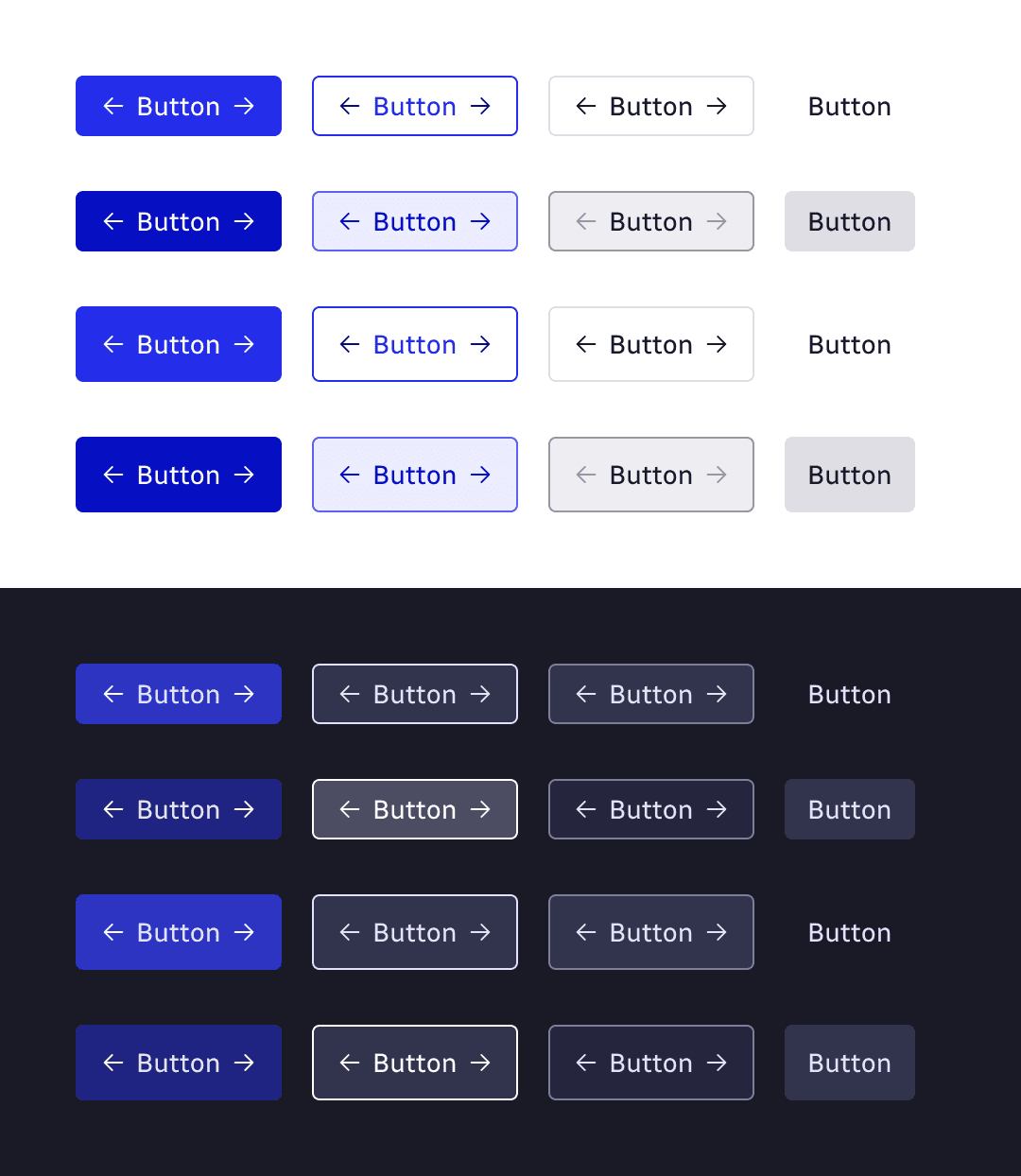
Design Solutions
Building the Design System First
My approach was to build the design system before the UI. That decision came directly from what I'd learned at Zyte. If the foundation isn't right, everything built on top of it is fragile.
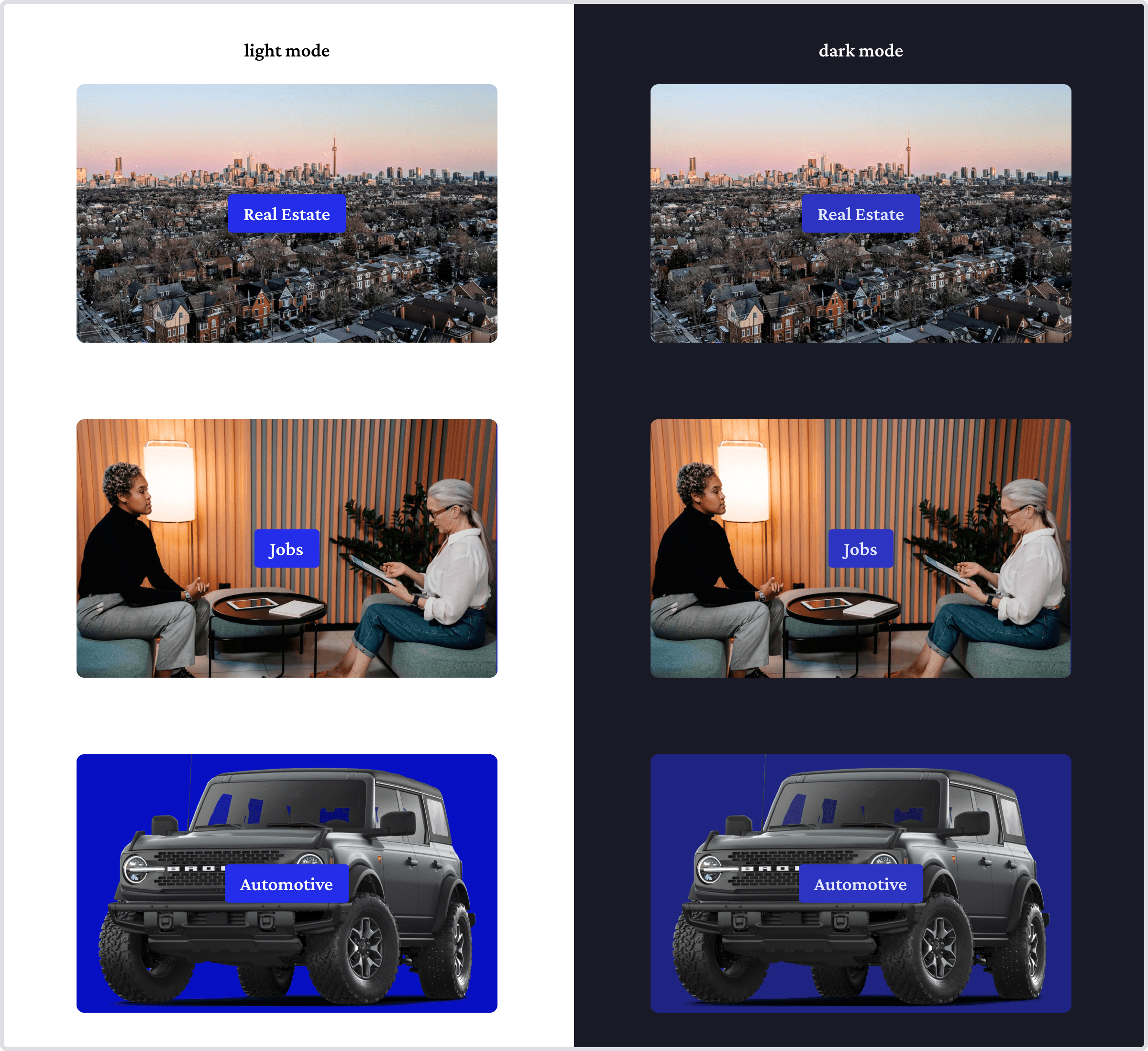
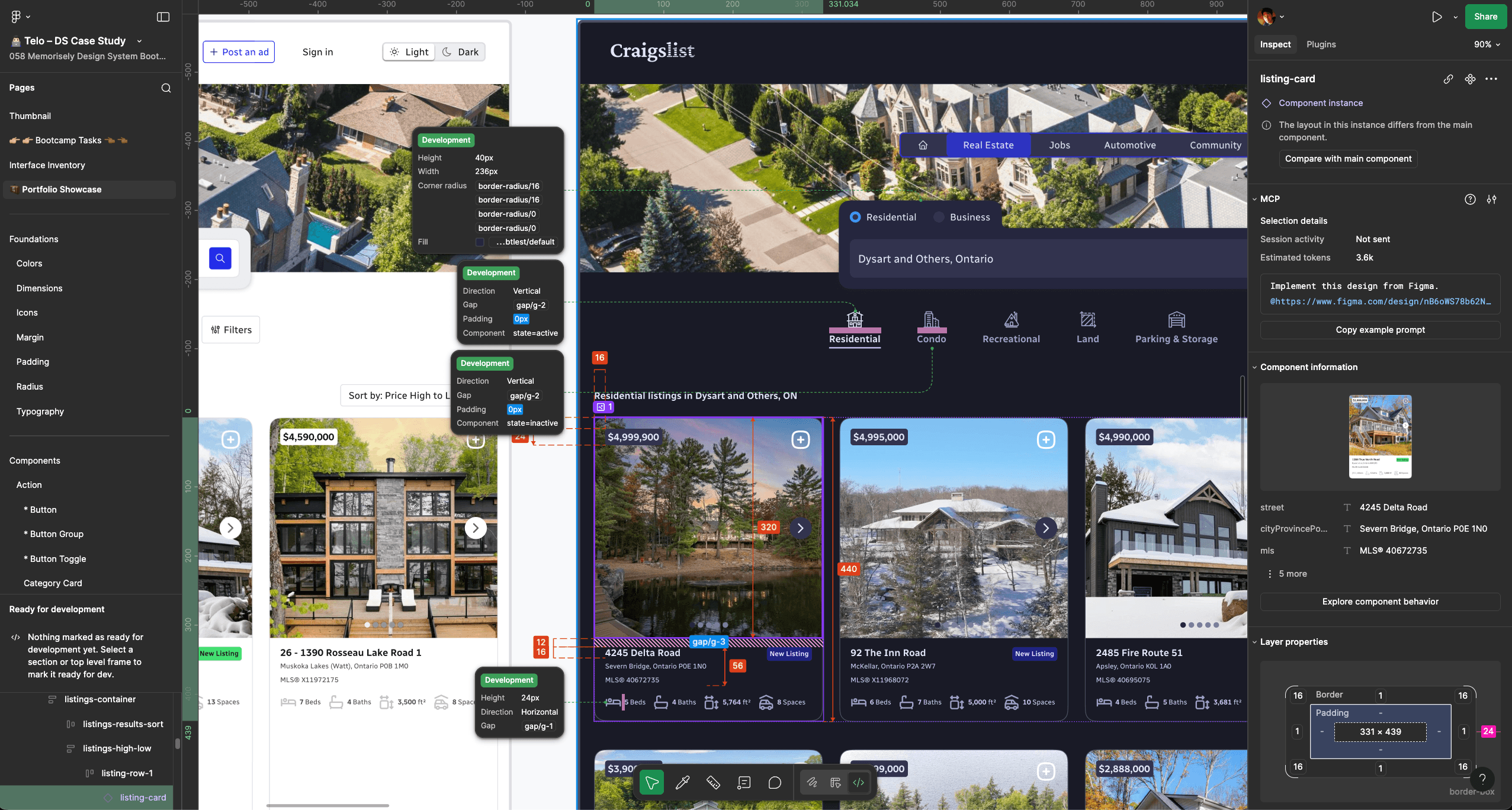
Starting from atoms, I built up a working component library in Figma. Colour tokens, typography scales, spacing rules, interactive states. Each component was designed with consistency and reusability in mind, so that by the time I got to full page layouts, every element already spoke the same visual language.
Design Solutions
Building the Design System First
My approach was to build the design system before the UI. That decision came directly from what I'd learned at Zyte. If the foundation isn't right, everything built on top of it is fragile.
Starting from atoms, I built up a working component library in Figma. Colour tokens, typography scales, spacing rules, interactive states. Each component was designed with consistency and reusability in mind, so that by the time I got to full page layouts, every element already spoke the same visual language.


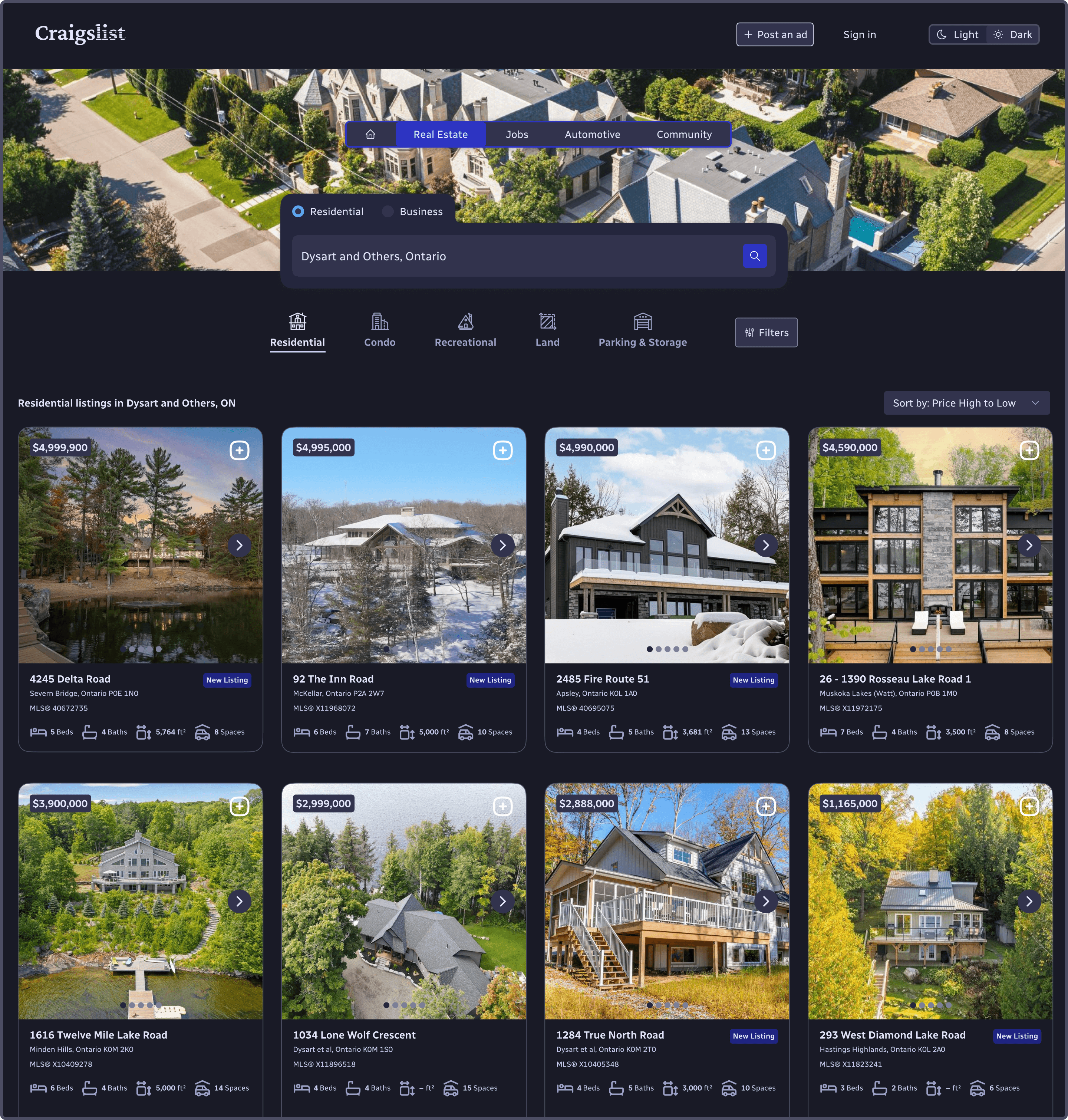
Design Solutions
Redesigning the Core Flows
With the system in place, I redesigned the core user flows. Browsing listings, viewing a listing, and filtering. These are the moments that matter most to Craigslist users, and they were all carrying the most friction.
The redesign focused on three things. Clear visual hierarchy so users always knew what to look at first. Strong affordances so interactive elements communicated their purpose without any guesswork. And a consistent navigation structure that stayed predictable no matter where you were in the experience.
FIGMA PROTOTYPE
Key Outcomes
Clear visual cues
Increased efficiency
Better usability
Key Outcomes
Clear visual cues
Increased efficiency
Better usability
Key Outcomes
Clear visual cues
Increased efficiency
Better usability
Key Outcomes
Clear visual cues
Increased efficiency
Better usability
Conclusion
Staying Ahead on Purpose
This project reminded me why I love design. Not because it's always client-driven or deadline-pressured, but because a good problem is a good problem regardless of where it comes from.
Doing the Memorisely bootcamp alongside being one of the first students in their AI Design, AI Design Systems, and AI Coding programs was a deliberate choice to stay ahead. The field is moving fast. I prefer to be proactive rather than waiting to catch up.
The field is moving fast. I prefer to be proactive rather than waiting to catch up.
Conclusion
Staying Ahead on Purpose
This project reminded me why I love design. Not because it's always client-driven or deadline-pressured, but because a good problem is a good problem regardless of where it comes from.
Doing the Memorisely bootcamp alongside being one of the first students in their AI Design, AI Design Systems, and AI Coding programs was a deliberate choice to stay ahead. The field is moving fast. I prefer to be proactive rather than waiting to catch up.