Usage Stats Design
Client
Sector
Role
Zyte
Web Data Extraction
End-to-end product design encompassing research, conceptualization, visualization, and testing
SUMMARY
Zyte is the original and best web data platform. I created a dashboard for web extraction engineers and developers to understand their usage and requests through data visualization.
Challenge
Large datasets, visualizing them with different filters and functions while meeting customers' needs, make this project challenging.
User Research
An effective dashboard is the product not of cute gauges, meters and traffic lights, but rather of informed design: more science than art, more simplicity than dazzle. It is, above all else, about communication
– Stephen Few (from Information Dashboard Design: The Effective Communication of Visual Data, 2006)
Information Dashboard Design - User Interview Questions
Point of View Statement
User
Developers, Enterprise Customers
Need
Large amounts of data are difficult to process in a display if I want to analyze specific groups of data sets.
Insight
We need to organize how to display the data sets. We need filtering features to display the right amount of data at the right time.
Design Solutions
Gestalt Principles
The speed and accuracy at which users can compare, deduce, and detect particular patterns (alongside numerous other potential functions) ought to serve as the benchmark for evaluating techniques employed in visualizing information.
I worked primarily with the Tech Lead and a UX Designer to understand the limitations and possibilities of the data driving the aggregated results.
Grouping features using the law of similarity for buttons, dropdowns, and inputs are perceived to be similar in appearance but function differently. Similarity can be exploited when items cannot be placed within proximity to each other or wouldn't be logical to do.
Common Display Methods
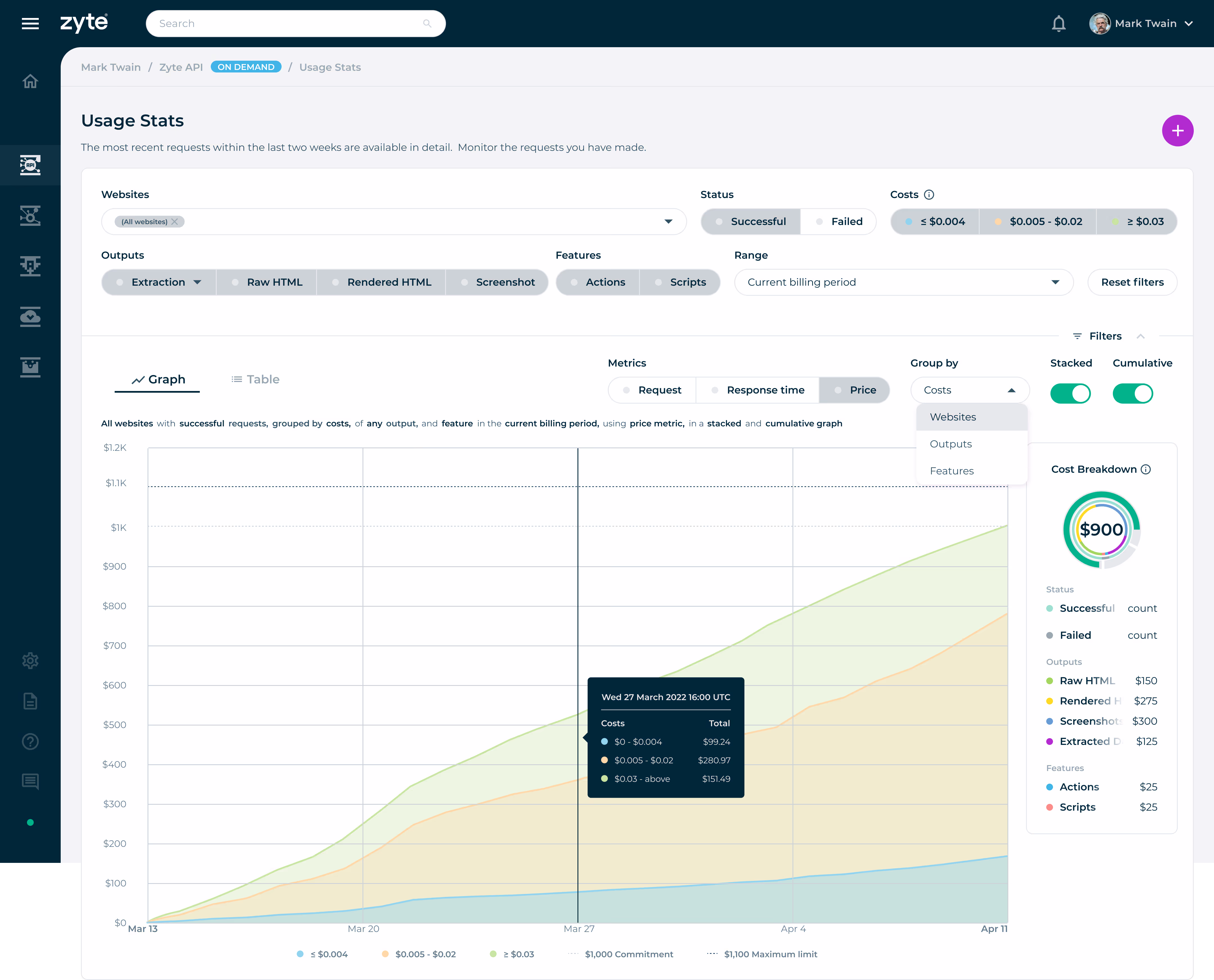
Line charts are useful for showing trends over time or continuous data. They are commonly used to visualize data that changes over a continuous range, such as stock prices, temperature fluctuations, or website traffic over time. Line charts connect data points with lines, making it easy to observe patterns and changes.
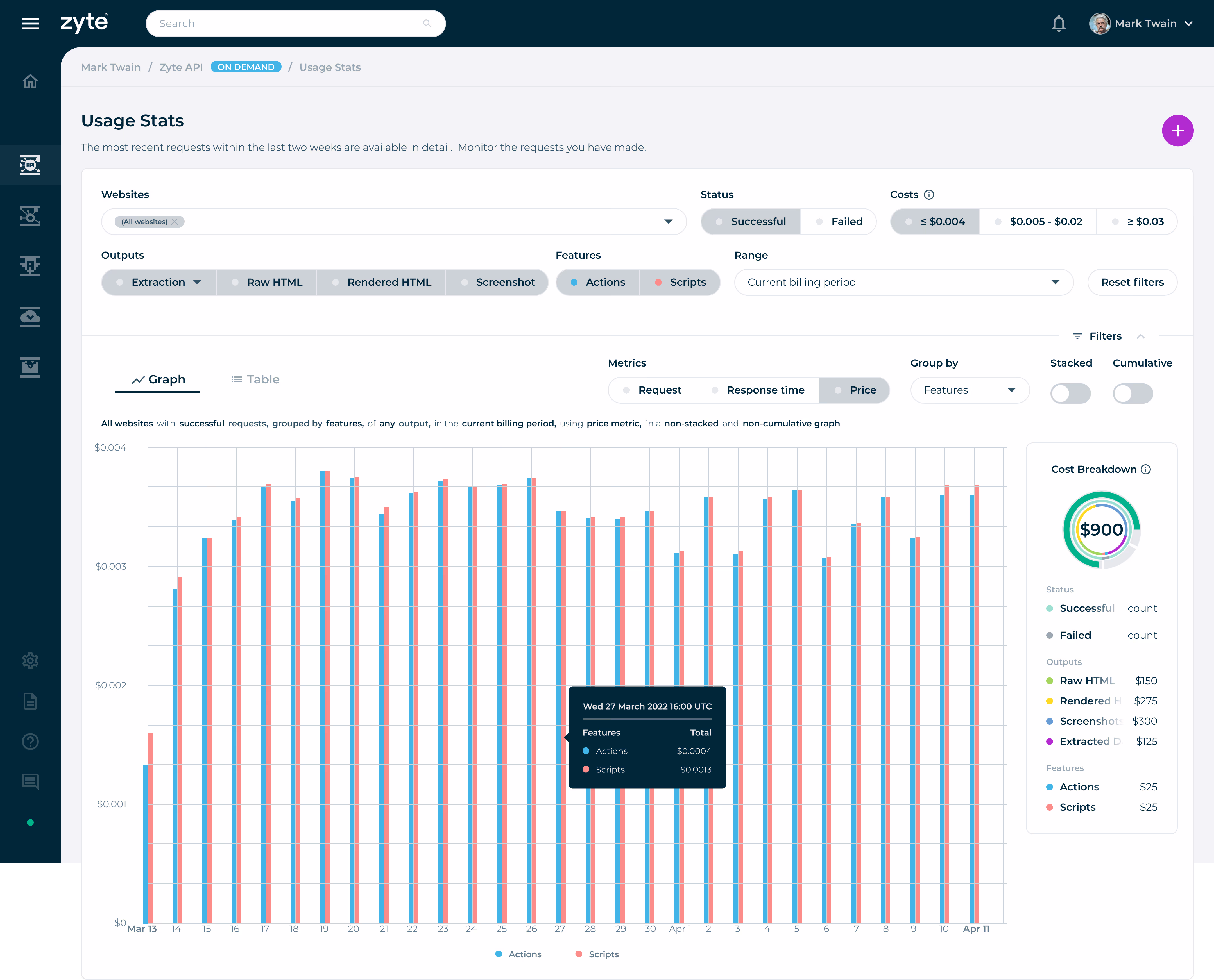
Bar graphs allow for the quick comprehension of categorical information. Using high contrasting colours, the viewer can quickly gauge what dataset has a larger or smaller value. Effective for comparing values between groups of data and showing distributions or proportions.
Circular bar charts are often used when the goal is to create an attention-captivating chart with an aggregate sense of the data. Humans are naturally drawn to circles and curves, making this type of chart visually appealing.
Solution Sketch
A quick sketch of how the UI components such as the filters of the data visualization dashboard and graph displays would function.
Visual Design
I studied and completed a certificate in Information Visualization to help identify target information quickly, accurately, and present complex and abstract data in a way that is easy for people to understand.
Using colour serves as a powerful and implicit method of communicating meaning. Clean, banned, and failed are visually represented by green, red, and gray to cue or signal users what state their requests are.
Group by Costs filter is enabled: The Costs button filters are represented by colours to signify the type of data the user chooses to display. The rest of the filters, such as Status, Output, Features, and Metrics, can have a single or multiple selection of datasets to visualize the results in the center region.
Non-cumulative: When cumulative is disabled using the toggle switch, the data displays the number of requests at each point in time defined by the selected time interval.
Filter setting: Show me successful outputs with extraction, including the actions and script features that cost less than or equal to $0.004. An additional filter setting is to show metrics in price, grouped by features presented in stacked and cumulative graphs.
A table view is provided to users to inform them of their specific website request.
Conclusion
By understanding the roles, activities, and goals of our users, I identified their challenges and create a tangible solution.